Who doesn’t know the famous APPLE logo?
One of the iconic and universally recognized symbols of the Apple Company.
The perfect depiction of innovation, knowledge and lust.
But do you know the current logo was completely different when Apple got its identity?
Yes!
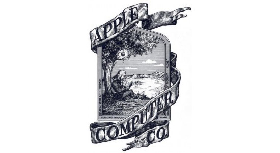
It was a complex illustration that links to the story of Isaac Newton when Apple fell on his head.
It was designed in 1976 by Ronald Wayne – third co-founder of the company.

The font on the logo was merely a message which says:
A Mind Forever Voyaging Through Strange Seas of Thought —Alone.
Newton indeed did a remarkable discovery under the Apple tree, but the story doesn’t fit well on Steve’s dream company Apple.
He wanted a sophisticated design which is simple enough to grab the viewer’s attention; something that is unforgettable.
He had to present Apple in a computer fare so he wanted a modern logo design that can complement his company.
For this, he hired Robert Janoff – a creative expert to do the job.
At that time, Apple was not a mega-company as now, but Steve wants the logo to be an ultimate class.
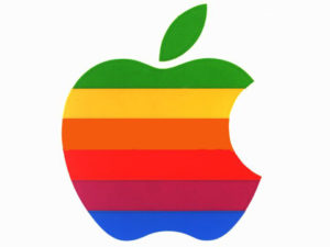
So, after a number of designs, Janoff came up with a rainbow-coloured bitten logo which clicked Steve’s mind.
When asked about the theory of the logo he said that the ‘bite’ on the apple states that the logo is an apple and not a tomato. And it also represents the ‘byte’ which was a fitting reference to a tech company.

But like a rainbow, the colours weren’t in sequence. Steve wanted the top to be green to couple it with the leaf.
The logo impressed Jobs and was used for the company for 20 years straight.
But later, the company realized that the logo branding is costing them double efforts and money. Since printing colour stripes in steps need to be work side by side and if any colour was missed, the logo stripes had to be sent for printing again.
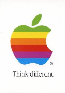
Steve doesn’t consider this an issue and continued with the same logo but with slight changes like.

Apple logo remains unchanged for a long time, but the text was replaced with the tagline that says:

In 1997, Mac featured a powerful White Logo which later became a monochrome logo.

Shortly, after the shift to the monochrome logo, things started to get colourful with the introduction of a translucent blue logo.

And this design carries forward on the fruit coloured iMac’s.
The inconsistency continues between the monochrome and the flashy aqua logo until the release of Mac OS 10 which features a white logo.
The dispute then settled as the new Silver logo which you see now on all Apple products.

Apple Logo Design Starts with a Story & Ends with Innovation – It Leaves Me With 3 Best Lessons
The Ability to Improve
Every dream starts with a story. Someone, somewhere wants to do something. You can be wrong, you can fail but you should start. Your audience might be zero when you start but if you show the consistency to improve, you might last with everlasting success.
Steve Jobs isn’t here with us, but his dream is progressing. His dream doesn’t die with his death. That’s how your startup should be. If you want it to grow even if you don’t exist you have to fight, you have to give up your comfort, and you have to achieve even if it comes after 100 times failure. You should always show up, and you’ll reach your destination one day.
Less is More
If Steve had been satisfied with the illustration of the Newton and Apple, he wouldn’t have come out with the classic, viable Apple logo. The illustration was not only complex but also contradict the company values.
Apart from that, it would also hit his company ethos. So, always keep in mind when you’re designing something you don’t have to tell the whole story picture by picture. You should design in such a way that a plain sailing icon conveys the whole story. Make it simple yet outstanding piece of art because simplicity sets easily on people’s mind rather than a complex storyboard. Take McDonald’s and Nike logo for example.
Nature Is Powerful
If Apple wouldn’t have fall on Newton’s head, there wouldn’t be no theory of gravity today. And if no theory of gravity so we would have deprived for the beautiful Apple logo. Nature is the best professor. It institutes our mind with peace and creativity when we learn to inhale it. You should do a digital detox everyday by plugging in to nature and experience the mindfulness.
Reading, on the other hand, ignites the wisdom in you. It makes you learned in your profession. If you also have a dream to innovate something like Apple logo design then you must harness the knowledge first.
At Last: Innovation
Apple is all about Innovation. If you think you want to do something, learn to be different like Apple logo design. If you choose to be the same as may others in the play, you will end up nowhere. Explore yourself and think the role you can play in setting a unique identity of yourself. No matter if you choose the same job, your creativity will set you apart from the rest of the pack. Innovation is the key.
I hope you also agree with the lessons I extracted from the story. I’d love to know the points you take out from the evolution of Apple logo.
This case study is a collaborative research work of our writers and expert designers from Logo King, an emerging logo design and branding company in the USA who have experience in working with leading startups around the world
I prefer books and diaries more than phones and Facebook. Soulfully connected to Pakistan. And I passionately believe that I can change the world through blogging.


its interesting how one logo can teach us much. wow
Yeah..that’s my point 🙂
Good write-up!
Thank you so much, quite motivated to receive your comment.